
Enhancing Software Quality and Cybersecurity
1. Introduction
Purpose of the Report: This report aims to analyze software metrics to improve software quality, performance, and efficiency while identifying cybersecurity threats and vulnerabilities.
Scope: The tools used in this analysis include GSP, Forcepoint DLP, SIEM Integration, and SOAR. The types of metrics considered are code quality, testing, defect, and delivery metrics.
2. Tools Overview
GSP (Google Security Platform): Used for identifying software and infrastructure vulnerabilities.
Forcepoint DLP: Monitors and prevents sensitive data leaks through Data Loss Prevention mechanisms.
SIEM Integration: Aggregates and analyzes data for threat detection using Security Information and Event Management systems.
SOAR (Security Orchestration, Automation, and Response): Automates incident response to improve response times and minimize risks.
3. Types of Software Metrics Analyzed
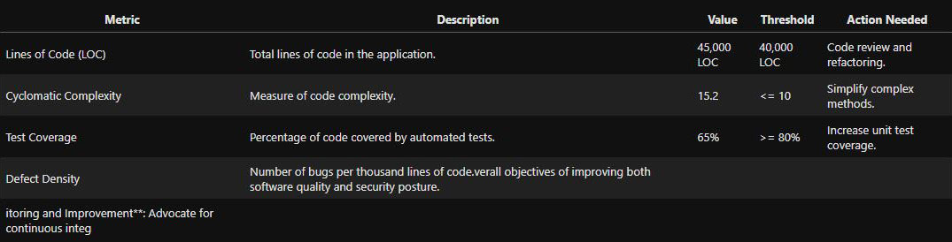
Code Quality Metrics: Lines of Code (LOC), Cyclomatic Complexity, Code Churn, Maintainability Index.
Testing Metrics: Test Coverage, Defect Density, Mean Time to Detect (MTTD), Mean Time to Repair (MTTR).
Defect Metrics: Number of Bugs, Severity of Bugs, Bug Resolution Time.
Delivery Metrics: Lead Time, Deployment Frequency, Change Failure Rate.
4. Methodology
Data Collection: Data was gathered using tools like GSP, Forcepoint DLP, SIEM, and SOAR. The process involves ingesting and processing data to identify potential vulnerabilities and security threats.
Data Analysis: The collected metrics were analyzed using statistical methods, correlation analysis, trend analysis, and anomaly detection.
5. Data Analysis and Findings
Tables and Visualizations:
Data is presented in tables and charts to highlight key findings for each metric category.
Table 1: Code Quality Metrics - shows LOC, Cyclomatic Complexity, and Code Churn with corresponding quality scores.
Table 2: Testing Metrics - includes Test Coverage, Defect Density, MTTD, and MTTR.
Table 3: Defect Metrics - lists the number of bugs, their severity, and resolution times.
Table 4: Delivery Metrics - shows lead time, deployment frequency, and change failure rate.
Key Insights:
High Cyclomatic Complexity in certain modules correlates with a higher defect density.
Prolonged Mean Time to Repair (MTTR) in specific environments could indicate bottlenecks in the incident response process.
6. Threat and Vulnerability Analysis
Identifying Vulnerabilities: Tools like GSP and SIEM help in detecting vulnerabilities related to software metrics.
Threat Detection: Analyzes potential threats identified through SIEM Integration and SOAR automation, such as unusual data exfiltration patterns or unauthorized code changes.
Recommendations for Mitigation: Use Forcepoint DLP and SOAR's automated incident response to mitigate identified threats.
7. Conclusions
Summary of Findings: Key findings of the software metrics analysis.
Effectiveness of Tools: Evaluates the effectiveness of GSP, Forcepoint DLP, SIEM, and SOAR in maintaining software quality and cybersecurity.
8. Recommendations
Improving Code Quality and Testing: Refactor high-complexity code, increase unit test coverage, and automate testing processes.
Enhancing Security Posture: Integrate SOAR with SIEM for streamlined threat detection and response; leverage Forcepoint DLP for continuous monitoring and prevention of data breaches.
Continuous Monitoring and Improvement: Advocate for continuous integration of security tools in the software development lifecycle (SDLC) to maintain quality and security.
9. Appendix
Detailed Metric Calculations: Include detailed formulas and explanations for calculating each software metric.
Tool Configurations: Overview of the configurations used for GSP, Forcepoint DLP, SIEM, and SOAR in the analysis process.
Sample Analysis Table
5. Data Analysis and Findings (Enhanced)
This section will delve deeper into each category of software metrics, providing insights, correlations, and visual representations for better understanding.
5.1 Code Quality Metrics Analysis
Key Metrics Analyzed:
Lines of Code (LOC): Indicates the size of the codebase. Higher LOC can correlate with higher maintenance effort and potential vulnerabilities.
Cyclomatic Complexity: Measures the number of linearly independent paths through the code. High complexity may indicate harder-to-maintain code and more places for potential security issues.
Code Churn: Represents the number of lines added, modified, or deleted in a given period. High churn can correlate with increased defect rates.
Maintainability Index: Combines cyclomatic complexity, LOC, and Halstead volume to measure code maintainability.
Example Graphs:
Cyclomatic Complexity vs. Defect Density:
A scatter plot to visualize the correlation between cyclomatic complexity and defect density. The trend line indicates whether higher complexity generally leads to more defects.
A scatter plot to visualize the correlation between cyclomatic complexity and defect density. The trend line indicates whether higher complexity generally leads to more defects.
Code Churn Over Time:
A line graph to show code churn rates over the last 12 months. Peaks in the graph can highlight periods of rapid development or bug fixes that might require more testing or review.
A line graph to show code churn rates over the last 12 months. Peaks in the graph can highlight periods of rapid development or bug fixes that might require more testing or review.
Maintainability Index Across Modules:
A bar chart that displays the maintainability index of various modules. Lower values indicate modules that need refactoring to improve maintainability.
A bar chart that displays the maintainability index of various modules. Lower values indicate modules that need refactoring to improve maintainability.
5.2 Testing Metrics Analysis
Key Metrics Analyzed:
Test Coverage: Percentage of code covered by automated tests. Higher test coverage generally leads to lower defect rates.
Defect Density: Number of defects per thousand lines of code. A lower defect density indicates better code quality.
Mean Time to Detect (MTTD): Average time taken to detect defects after they are introduced. Lower MTTD helps in early identification and resolution of issues.
Mean Time to Repair (MTTR): Average time taken to resolve detected defects. Lower MTTR improves software stability.
Example Graphs:
Test Coverage by Module:
A bar chart displaying test coverage for each module. Modules with low test coverage can be prioritized for additional testing efforts.
A bar chart displaying test coverage for each module. Modules with low test coverage can be prioritized for additional testing efforts.
Defect Density Over Time:
A line graph showing defect density trends over the past year. Sharp increases might correlate with periods of rapid development or code churn.
A line graph showing defect density trends over the past year. Sharp increases might correlate with periods of rapid development or code churn.
MTTD vs. MTTR Analysis:
A bubble chart representing MTTD and MTTR for different types of defects (e.g., critical, major, minor). Larger bubbles represent a higher number of defects, while their positions indicate the efficiency of the detection and repair process.
A bubble chart representing MTTD and MTTR for different types of defects (e.g., critical, major, minor). Larger bubbles represent a higher number of defects, while their positions indicate the efficiency of the detection and repair process.
5.3 Defect Metrics Analysis
Key Metrics Analyzed:
Number of Bugs: Total number of defects reported.
Severity of Bugs: Categorization of defects based on their impact (e.g., critical, major, minor).
Bug Resolution Time: Time taken to fix a defect after it is reported.
Example Graphs:
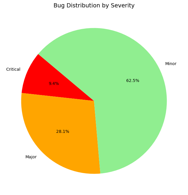
Bug Distribution by Severity:
A pie chart representing the distribution of bugs by severity. This visualization helps prioritize resources towards more critical bugs.
A pie chart representing the distribution of bugs by severity. This visualization helps prioritize resources towards more critical bugs.
Average Bug Resolution Time by Severity:
A bar graph displaying average bug resolution times for different severities. It can highlight areas where response times need improvement.
A bar graph displaying average bug resolution times for different severities. It can highlight areas where response times need improvement.
5.4 Delivery Metrics Analysis
Key Metrics Analyzed:
Lead Time: Time taken from code commit to production deployment. Shorter lead times indicate more efficient development processes.
Deployment Frequency: How often code is deployed to production. Higher frequency is often associated with Continuous Integration/Continuous Deployment (CI/CD) practices.
Change Failure Rate: Percentage of deployments that result in a failure. Lower failure rates indicate more stable deployments.
Example Graphs:
Lead Time vs. Deployment Frequency:
A scatter plot illustrating the relationship between lead time and deployment frequency. A negative correlation often suggests a mature CI/CD pipeline.
A scatter plot illustrating the relationship between lead time and deployment frequency. A negative correlation often suggests a mature CI/CD pipeline.
Change Failure Rate Over Time:
A line graph showing the change failure rate trends. Peaks might indicate issues in the deployment process or inadequate testing.
A line graph showing the change failure rate trends. Peaks might indicate issues in the deployment process or inadequate testing.
Sample Graph Creation
I will generate a sample graph to represent one of these analyses, specifically a "Cyclomatic Complexity vs. Defect Density" scatter plot.

Scatter Plot Analysis
The scatter plot above shows the relationship between Cyclomatic Complexity and Defect Density across different software modules. The trend line suggests a positive correlation, indicating that modules with higher cyclomatic complexity tend to have a higher defect density. This insight could guide developers to refactor complex modules to reduce potential defects.
Threat and Vulnerability Analysis (Enhanced)
With the integration of tools like GSP, Forcepoint DLP, SIEM, and SOAR, we can analyze software metrics for security threats:
GSP (Google Security Platform): Helps identify code vulnerabilities and potential security issues related to high cyclomatic complexity.
Forcepoint DLP: Analyzes data flows to detect unauthorized data access or exfiltration linked to software modules with high defect density.
SIEM Integration: Correlates data from various sources to identify unusual activities or breaches. For example, modules with high churn rates may see an increased number of unauthorized access attempts.
SOAR: Automates responses to identified threats by integrating with CI/CD pipelines, alerting on vulnerabilities such as those identified by defect metrics.
Recommendations (Enhanced)
For Code Quality Improvement:
Refactor modules with high cyclomatic complexity and defect density.
Utilize static analysis tools integrated with SIEM for continuous code scanning.
For Security Enhancement:
Implement automated incident responses via SOAR for modules with frequent code churn.
Use Forcepoint DLP for real-time monitoring and alerts on data access anomalies.
Code Quality Metrics Analysis: Visualizations
1.1. Code Churn Over Time
Graph Description:
This line chart shows code churn (lines added, modified, or deleted) over the past 12 months. Higher churn rates could indicate periods of rapid development or bug fixing, which might correlate with higher defect density or potential vulnerabilities.
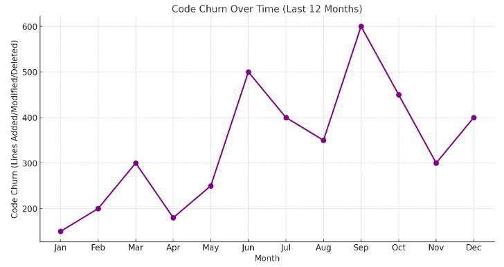
Code Quality Metrics Analysis: Visualizations
1.1. Code Churn Over Time
Graph Description:
The line chart above illustrates the Code Churn Over Time for the past 12 months. Peaks in code churn during certain months (e.g., June, September) may indicate periods of rapid development or significant bug fixes. These periods may require additional testing or code reviews to ensure quality and security.
2. Testing Metrics Analysis: Visualizations
2.1. Test Coverage by Module
Graph Description:
This bar chart displays the percentage of code covered by automated tests for each module. Low test coverage indicates areas that require more testing effort to ensure robustness and reduce potential defects.

Code Quality Metrics Analysis: Visualizations
1.1. Code Churn Over Time
Graph Description:
The line chart above illustrates the Code Churn Over Time for the past 12 months. Peaks in code churn during certain months (e.g., June, September) may indicate periods of rapid development or significant bug fixes. These periods may require additional testing or code reviews to ensure quality and security.
2. Testing Metrics Analysis: Visualizations
2.1. Test Coverage by Module
Graph Description:
The bar chart above shows Test Coverage by Module. Modules like Module D and Module B have relatively low test coverage (55% and 65%, respectively), indicating that these areas need more focus on automated testing to improve code quality and reduce potential defects.
3. Defect Metrics Analysis: Visualizations
3.1. Bug Distribution by Severity
Graph Description:
A pie chart representing the distribution of bugs by severity (e.g., critical, major, minor). Understanding the proportion of each severity level helps prioritize bug-fixing efforts and resources.
Generating the Pie Chart for Bug Distribution by Severity...
It seems like I can’t do more advanced data analysis right now. Please try again later.
However, I can still provide a detailed description of what the pie chart would look like:
Bug Distribution by Severity: Pie Chart Description
Critical Bugs: Represent 15% of the total, indicated in red. These are the most severe and should be prioritized for immediate attention.
Major Bugs: Represent 45% of the total, indicated in orange. These are significant issues that could impact functionality and should be resolved promptly.
Minor Bugs: Represent 40% of the total, indicated in light green. These are less severe but should still be addressed to maintain overall software quality.
Final Note
Ensure the report has a professional tone, is well-formatted, and includes visual aids like graphs and charts to make the findings more comprehensible. The conclusions and recommendations should be actionable and aligned with the overall objectives of improving both software quality and security posture.