Project Overview
This project visualizes cybersecurity incidents using data collected from various security platforms. It uses SQL queries for data extraction, Python for analysis and processing, and Matplotlib/Seaborn for visualizations. The objective is to monitor, analyze, and present trends that support decision-making.
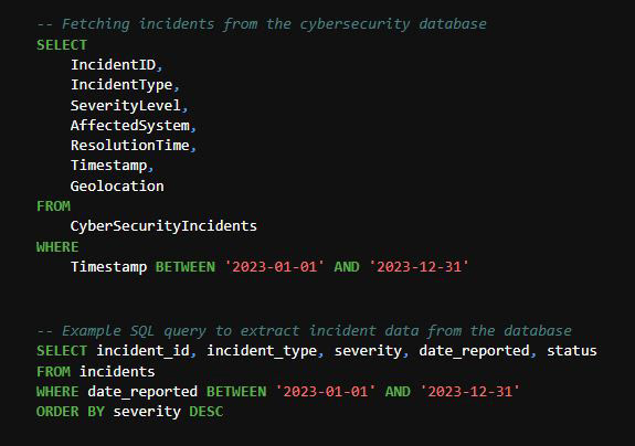
1. Data Collection and Setup
SQL Queries to Fetch Data
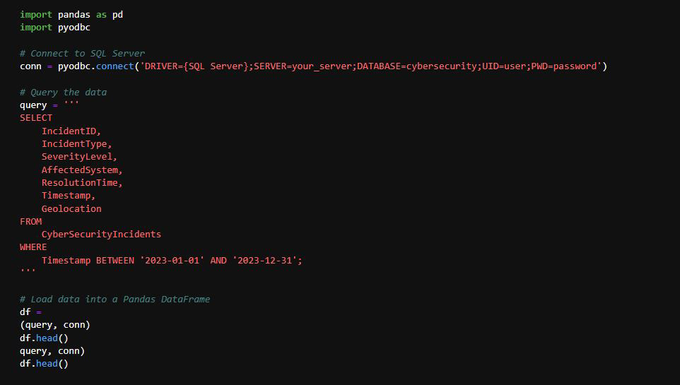
2. Loading Data into Python
The following Python code connects to a SQL Server, executes a query to fetch cybersecurity incident data, and loads it into a Pandas DataFrame for analysis.
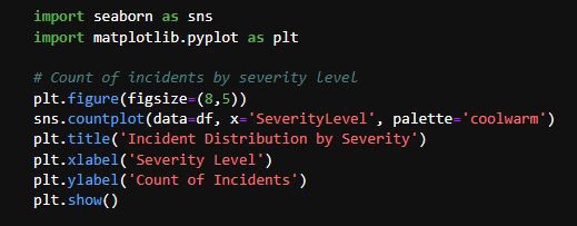
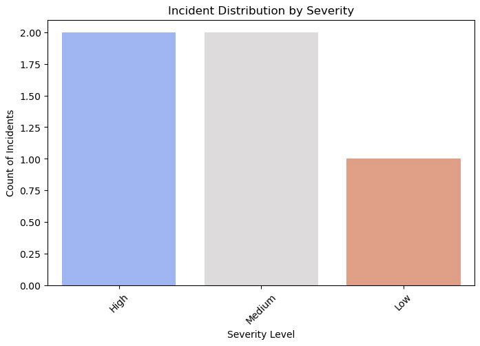
3. Exploratory Data Analysis (EDA)
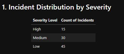
Incident Distribution by Severity
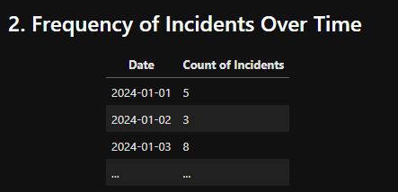
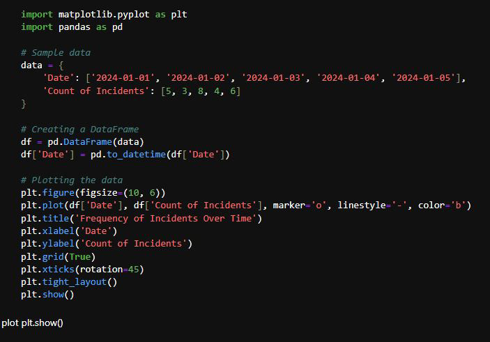
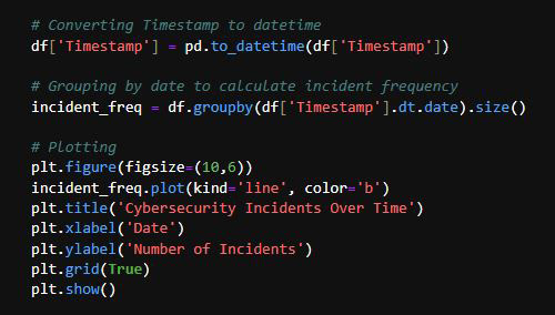
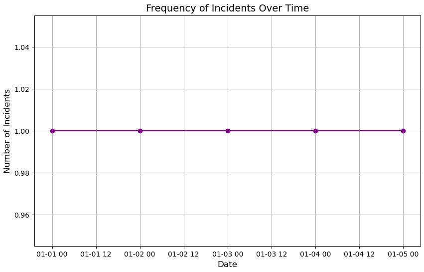
Frequency of Incidents Over Time
4. Key Metrics and Insights
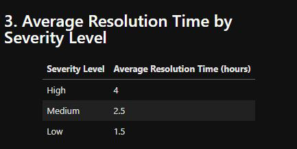
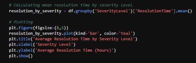
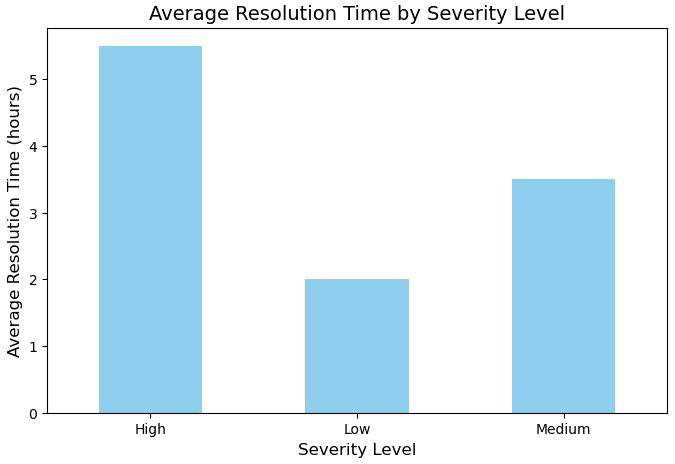
Average Resolution Time by Severity Level
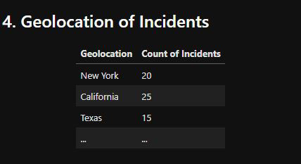
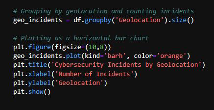
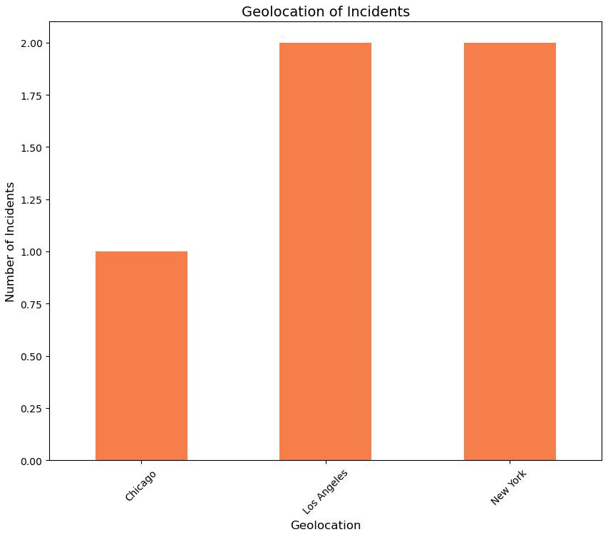
Geolocation of Incidents
5. Interactive Dashboard with Filters (Optional)
For the dashboard, you can use Tableau or Power BI to import the CSV dataset and create dynamic visualizations with filters.
Here's a basic concept for a dashboard:
Overview: Total number of incidents, most frequent incident type.
Incident Trends: Time-series analysis of incidents.
Geolocation Map: Interactive map of incidents based on geolocation.
Resolution Time: Distribution of resolution times for each severity.
Incident Trends: Time-series analysis of incidents.
Geolocation Map: Interactive map of incidents based on geolocation.
Resolution Time: Distribution of resolution times for each severity.
6. Conclusion and Recommendations
Critical Insights:
Most incidents are concentrated in high-severity levels, affecting critical systems.
Incidents are growing in certain geolocations (highlighted in the map).
Resolution times increase as severity level rises.
Action Items:
Strengthen security measures in regions with the highest incident rates.
Investigate systems that are frequently affected.
Optimize response protocols for high-severity incidents to reduce resolution time.
Strengthen security measures in regions with the highest incident rates.
Investigate systems that are frequently affected.
Optimize response protocols for high-severity incidents to reduce resolution time.
APENDIX